My work has had me focused on making websites more responsive. Part of taking a non-responsive design and back-porting some media queries into the CSS is identifying where the breakpoints for a particular design exist.
To aid in identifying where these breakpoints are I built a page with an iframe in it that would tell me how wide it is at any given time. More features were added and eventually we had a useful little tool. So here it is for your pleasure, the elegantly named:
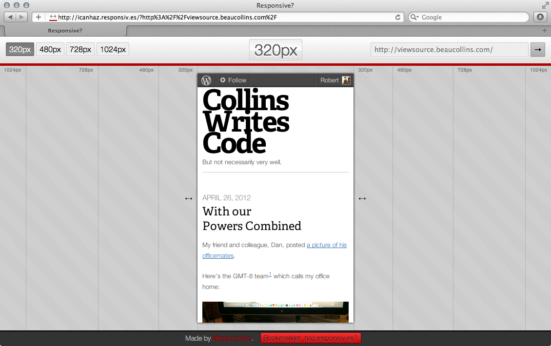
One particularly useful features is the bookmarklet. Drag that thing to your browser’s bookmark bar and then click it when you want to load up whatever page you happen to be looking at.
If you’d like to check out the source code it’s on Github. It’s mostly client side Javascript but with a little Node.js and CoffeeScript to help determine the X-FRAME-OPTIONS header for the site you are loading.
One reply on “Are you responsive?”
Reblogged this on Egill and commented:
Awesome tool that can help you with those responsiv.es!